The conditional historic method
The conditional historic method takes the same historic data, but conditions it based on starting valuation. It employs the apparent truism that a higher starting valuation should result in a lower forward return. If we take the smoothed earnings yield on equities as a proxy for return, and the same for the yield-to-maturity on US Treasuries, we see an attractive fit between starting valuation and forward return, at least on an overlapping basis (Figure 3).
Figure 3. Relationship between starting valuation and 10-year forward return for US stocks (top) and bonds (bottom), 1881-2024
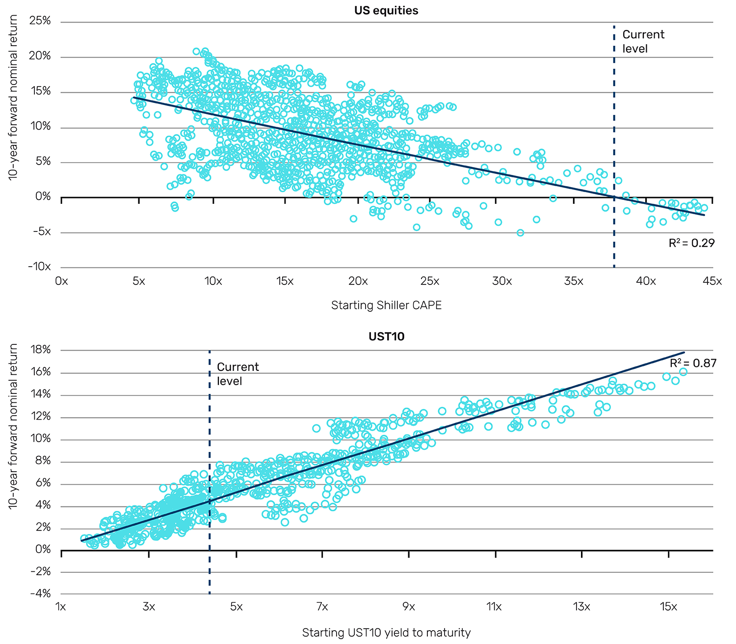
Source: Professor Shiller’s online database, GFD, Man Group calculations. As of December 2024.
If the historic precedent were to hold, we should expect 10-year nominal CAGRs3 to US stocks and bonds of 0% and 4%, respectively. Over the 150 years for which we have US inflation data, the lowest 10-year rolling inflation has been -4%, the average is +2% and the highest is +9%. Thus, for stocks, one could credibly forecast a range of real annualised returns over the next decade of between -9% and +4%, with a point estimate of -2%. This is bad news.
Arguably, these charts are melodramatic, given they use overlapping returns. So, while we think it a worthwhile exercise, we caution that it is easy to present such models in ways which are deceptively explanatory.
The theoretical method
The theoretical method involves building implied returns up from component parts based on current fundamental views.
The theoretical method applied to bonds
Given its importance, we start with the UST10 yield (which, as a by-product, will also give us an expected return for UST10).
We think about yield disaggregation as a three-part segmentation: trend growth, inflation expectation and term premium. When you lend money to the US government, or indeed any government with the ability to print the currency the bond is denominated in, you require compensation for these three things.
Constructing models that capture the essence of these three components is a huge undertaking and well beyond the scope of this paper. Moreover, there are already numerous indicators available for each.
In Figure 4, we show the range of a nominal set of indicators,4 as at the end of January 2025, along with their sum (fair value yield). After winsorising, this ranges from 3.6% to 7.4%, with a median of 5.5%.
Figure 4. Ranges of UST10 fair value yield using a selection of indicators
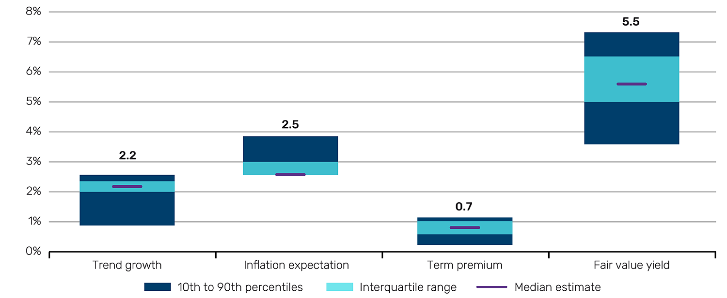
Source: Various sources as outlined in footnote 5, below. Collated from Bloomberg, NY Fed and the Livingston Survey. Levels calculated by Man Group. As of February 2025.
As at the end of January 2025, the yield and duration of the UST10 were 4.5% and 7.8%, respectively. Computing total return on a fixed income position is complex as it is influenced as much by the pathway of how interest rates change, as it is by the overall magnitude of the change. However, on a very simple basis5 this would translate into annual returns of +3.4% at the low end, and +4.7% at the top of the range, with a point estimate based on the median fair value yield of +4.2%.
The theoretical method applied to equities
The theoretical method also allows us to draw a baseline upon which to build a similar framework for equities. Because companies can (and do) raise debt, an equity can be viewed as a levered expression of aggregate economic growth. We have already accounted for trend growth in our decomposition of the bond yield. To determine the equity risk premium, or the increment over the Treasury curve that equity holders should theoretically demand, we need to account for changes in the overall risk profile of the economic backdrop.
One way of doing this is to find long-history metrics which gauge overall stress within an economy. This time, we have chosen six long-term measures of US economic risk.6 If these indicators are higher, potential turbulence is higher, and thereby the equity risk premium (ERP) should be higher to compensate.
In Figure 5, we combine these indicators and plot the aggregate alongside the Shiller excess CAPE yield.7 The higher the lines, the higher the implied economic risk, and the higher the ERP should be. Since the Global Financial Crisis (GFC), this metric has been relatively high, averaging 45%, bounded between 30% and 60%. That average would equate to an ERP of 7.5%. Currently, we are at the low end of the range, implying a premium of just under 4%. Both numbers are much higher than the current ERP of 1.1%. In other words, we’re looking at a significantly lower equity CAGR over the next 10 years than has been achieved over the last.
Figure 5. Aggregate economic risk indicator and Shiller excess CAPE yield
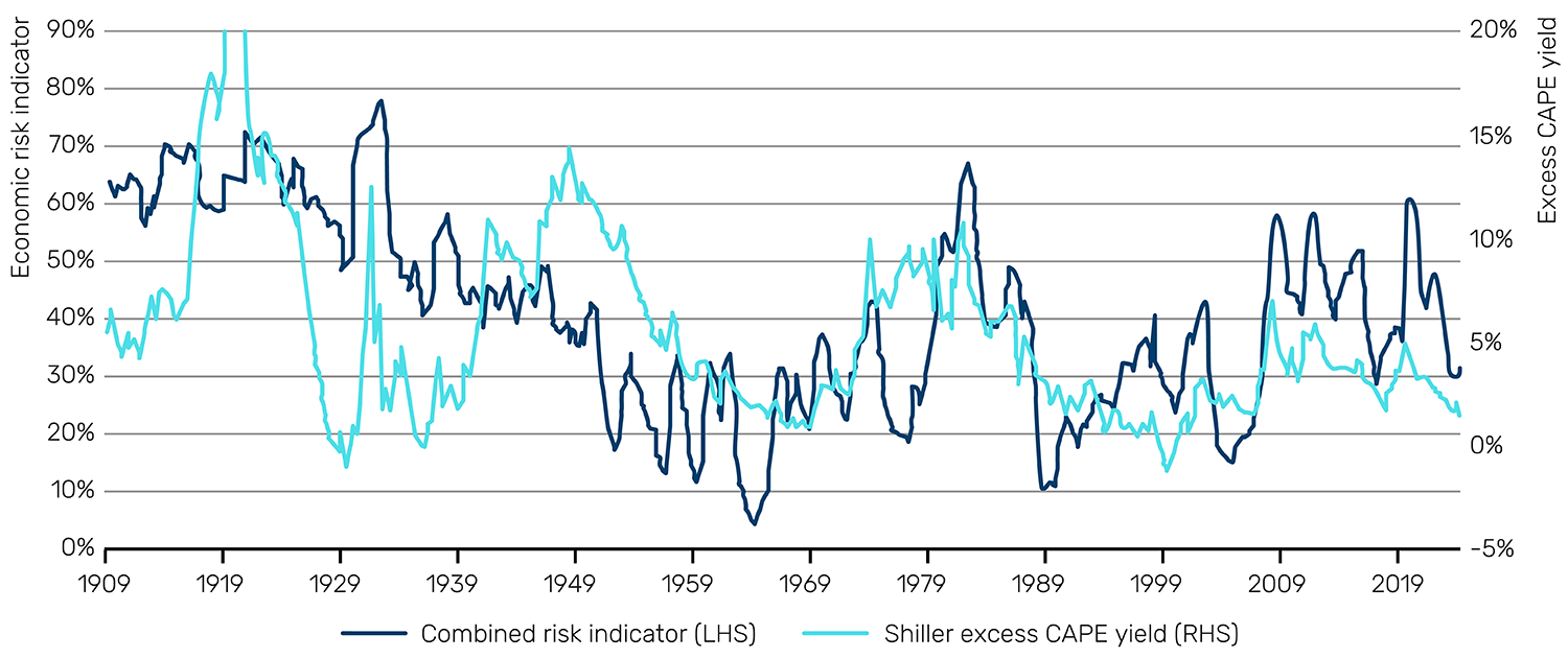
Source: Man Group calculations. As of December 2024.
To help give some quantum of how much lower, we can estimate nominal equity return on a 10-year forward view, implied by different UST10 yield levels combined with a range of ERPs. Unfortunately, our scenario analysis work implies an equity CMA in the 0 to -3% range, the most pessimistic estimate yet.
Meta-analysis
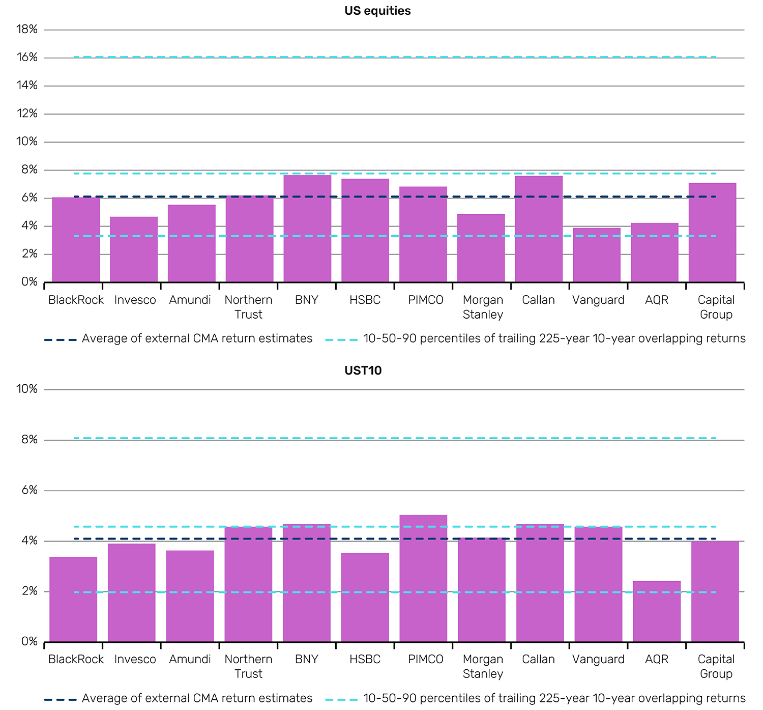
Another approach to CMAs is to simply take the average of everyone else’s estimates. We show the results of doing this for US equities and UST10 in Figure 6.
Figure 6. Third-party CMAs for US equities and UST10


Comments
Post a Comment